Your website is your business’s digital cover letter. It’s anything but likely that you would receive your customers in a scruffy space under construction. So why then would you have your website make a bad impression on them?
Discover what are the most common web design mistakes made by many companies on their corporate websites and you’ll be able to avoid them. Pay heed to the content of this article and secure for your company a website worthy of admiration by following our tips.
The most common web design errors
Carelessness, unawareness… There are many reasons why you can end up making one of the following web design errors. The important thing is to be aware of their existence so as to avoid making them.
1. 404 errors
These errors occur when someone tries to access web pages on our website that are no longer available. The URL may have changed or, in the case of an e-commerce, the product may have been discontinued.
Be it as it may, they convey our visitor a lack of concern for our website, as well as a bad user experience. If Google detects many web pages of this kind, it can interpret that the website’s contents are not updated and penalise its positioning.
The best way to avoid this mistake is to use tools such as Google Search Console to sweep our website periodically to spot them. This way you’ll be able to indicate search engines that the content is no longer available or redirect such web pages.
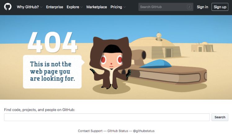
Customising the 404 error page is another way to improve user experience. By offering a navigation alternative like this, you’ll transform a negative experience into a positive one. And perhaps you can even make the user smile. GitHub, for instance, has included a nod to Star Wars and invites you to search the site.

2. The size of the web pages is too big
We endorse interaction, websites with dynamic contents, beautiful images, etc. but always without losing sight of the function of each of these elements.
Cluttering up your website with images, animations or videos can hinder navigation and, above all, make the access to it time-consuming. And if the latter happens, you will have two problems: users will probably abandon your website if they can’t access it within 3 seconds and Google will penalise its positioning. Try to always optimise the images that you upload to your website and don’t add content without a purpose.
Users will abandon your website if they can’t access it within 3 seconds and Google will penalise its positioning
3. The content is scarce
Pages that harbour a scant amount of content constitute one of the most common web design errors. It’s quite common to come across a company whose website includes a different section for each of the services that it offers but then just shows an image or a paragraph of text on each of these sections.
Keep the user always in mind and synthesise contents to the fullest extent. If you just want to give a broad stroke of the services you offer, group them together on the same web page. You will avoid redundant content and getting users to feel that they have wasted their time by clicking on a page that has nothing new to offer them.
Related content: | Growth Hacking: strategies to optimise your web conversion
4. Black Hat SEO
Good SEO is essential for positioning your website in search engines. However, not everything is ok to achieve this. You will sometimes come across designers who are eager to offer you shortcuts for making it quickly to the very top on Google’s search results. Our advice on this is crystal clear: take to your heels in the opposite direction.
Keyword stuffing and what is known as text over-optimisation (i.e. repeating keywords in an excessive and unnatural way) are two of the practices that are commonly penalised by Google. Along the same lines, another practice that was carried out some years ago was to include text of the same colour as the website’s background in a way that was only visible to search engines.

Another Black Hat SEO technique is cloaking. It consists of displaying certain contents for search engine spiders while redirecting the user to other contents. It’s currently an action that is chased after and strongly penalised by Google.
The key is to have common sense: always bet on quality texts and on contents that are interesting to your users and are optimised, but without losing their consistency and naturalness.
You may also be interested in: 5 signs you (finally) need to hire a SEO agency
5. The website is designed following a trend
As in any other discipline, web design is also subject to trends and buzzes. However, remodelling a website exclusively on the basis of a trend and without working on your corporate identity will only result in a website that’s prone to be very trendy during its first months but also to become outdated in a short time. Reject clones: be inspired by trends but refashion them to fit in with your company’s identity.
6. The images are of a poor quality
To avoid the problems associated with high-resolution images that we were previously discussing, you must not fall into doing the exact opposite and reject using poor-quality, pixelated or distorted images. Images have crucial relevance, especially in the case of online stores.
Use original images to show your facilities, products, etc. whenever possible. And when this is not possible, resort to quality image banks.
7. The colour combination is poor
The user’s point of view must be at the very centre of web design. Users will abandon your website if its colour scheme makes the contents unreadable, even if the website is well crafted.
Always trust designers. They are the experts whose advice you can rely on to set the best colour combination for your website and, thus, grant a good user experience.
You may also be interested in: The influence of colours in web design

8. The fonts are not easily readable
The consequences of this website design mistake are along the same lines as the previous one, so choose your website’s fonts well. Sometimes, fonts that are not very screen-friendly are chosen in an attempt to seek originality.
Choose − whenever possible − fonts such as ‘serif’ or ‘sans serif’ with a size that’s large enough for fluid reading. Normally, the minimum size to ensure fluid reading is 16px.
9. There is too much text
Providing valuable information? Yes. Pasting an endless plain text? Never! When navigating a website, users tend to scan contents rather than read them in depth. You will make it easier for users to find what they are looking for if you use bold letters, headings according to the content’s importance and short paragraphs.
10. Complex navigation
Creating a website with bad website architecture is a very common web design error. The information on your website should always be easily accessible. There is a key principle in web design and usability that we must always adhere to: the user should never have to click more than 3 times to go from the website’s homepage to any of its sections.
The user should never have to click more than 3 times to go from the website’s homepage to any of its sections.
There’s a myriad of bad practices we can come across in this regard: menus harbouring endless submenus, having too many different sections for different services but with very little information about them, etc. Plan competently on paper what structure your website should have and − whenever possible − group its contents together keeping your users’ needs always in mind.
How to avoid web design errors
Avoiding the most frequent website design errors can become a simple matter if you are working with the right team. Contact either a website design agency or professionals with proven experience on the matter like Yeeply.
All professionals included in our network have passed a very rigorous certification process that guarantees top quality in each of the projects they carry out. When addressing your website design project, having us as your digital partner will keep you away from the problems that this kind of projects entail.
Tell us how you want your website to be, and we’ll get started. We look forward to hearing from you!


