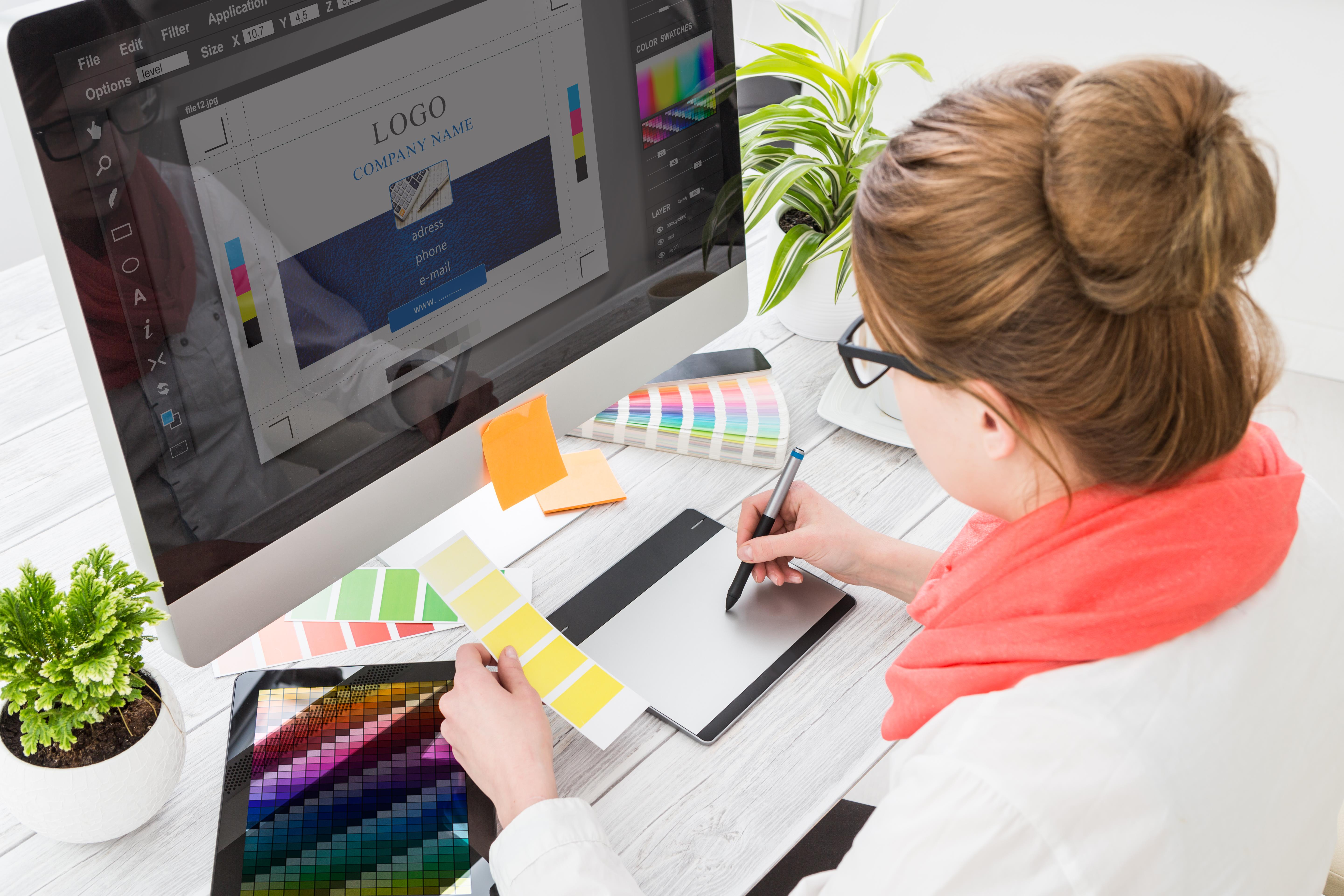
By the time we start planning our future application we think of everything that the user needs, how we are going to introduce it, how our application will react … But one of the most important features of app planning is the app design.
The truth is that often people don’t think of this part of app design, but is extremely important as it is the first contact a future application user will have and therefore the design of our app must be well suited for each type of app we make.
How much influence does app design have over the user?
App design is the determining factor for many users. This is because when you first download the application the first things we’re going to focus on are the app design, the animations and especially the user experience. This is why we have to carefully and correctly choose the design of our application specifically for each operating system and for every occasion. We are now going to show you a series of app designs from our experience.
Material Design
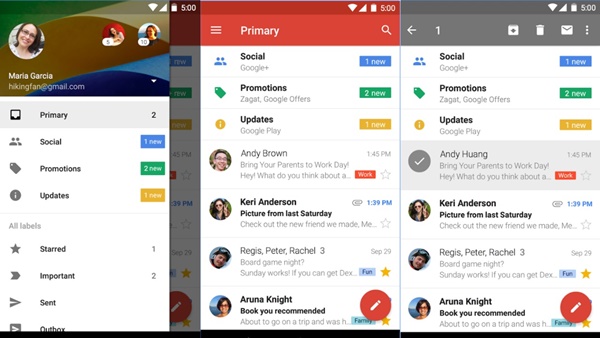
We start strong with the official design of Google. If what you’re looking for is a total integration with the operating system of green android, this is the style you should follow in your app design.
A design based on quadrangles and circles, with very characteristic colors and really nice and light animations for a really satisfying design experience. In this design we will have some depth in the objects that compose it, being able to clearly see what is on top of what.
What better than Google’s own applications to see and find out what Material Design is. Gmail, Google Keep, Google Play, Google Drive … without a doubt one of the largest ecosystems in the Android landscape.
Modern UI
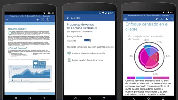
This is the name chosen to replace the famous Metro Design, the interface of applications and operating systems of Microsoft. With Modern UI we have the choice between a dark design and a clear design.
As for the app design style, it must be said that this is a design based on a single dimension. Everything we find here is at the same height and with a completely flat aesthetic accompanied by vivid colors that stand out against the black or white. However when it comes to animations we will see that flat design contains 3D animations.
To better visualise what this design style consists of we can focus on applications like Microsoft office automation, where we can see a clear example of what we are talking above.
iOS design
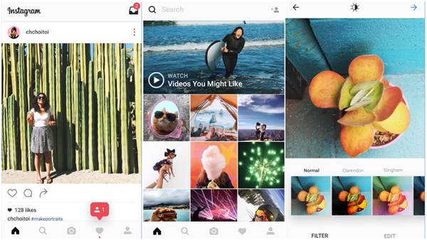
Here are some guidelines to follow to get an application perfectly integrated into the Apple terminals. A design based on the clarity of its components and where the important elements stand out above the rest.
This style of application is implemented by many of the applications that are on the Apple App Store, this is because it is a very lightweight design that offers a very satisfying user experience user thanks to what we need being clearly highlighted.
A clear example of the implementation of this design may be the radical change that the social network Instagram recently went through. It became a very retro design, a very flat aesthetic based on white and black where what stands out are the photographs.
General patterns
All these designs are good, but the fact is that when we are designing a new application we need to be clear about certain patterns in order that all applications are fully functional and they are recorded in the retinas of users so that they guide the user while surfing our app.
The burger menu
A benchmark of how we have to introduce a menu in our application. Fast, simple and functional. It is deployed from the side of our screen to display additional options or our menu.
Typography
It is true that each operating system uses a unique font in their operating systems. But we can also implement our own styles of letters. This will give our application a unique identity. But do not forget that style should be a clear font and not make the user dizzy
Animations
A resource that developers increasingly implement in their applications and you should think about using. It gives the application a unique experience and an identity.
Never lose your identity
An application is, among other things, a tool of communication with your user. It is therefore important to give your application a unique identity so that when someone sees a screenshot of that application they know immediately which application we are talking about.
This is achieved through the different screens of the application, the colors used in the design, fonts and backgrounds all act as differentiators from the competition.
Undoubtedly, this is one of the components of your brand identity. Although it is tempting to use closed styles, as described above, it is always much better to use a style with which you feel identified, this way we will ensure a unique identity without affecting navigation and user experience of the application.
Now you are clear about the design of your app and the features will have, you now want to know how much your application will cost. Enter the following link to make a small estimate of how much your application can cost: https://www.howmuchcostanapp.co.uk/

