The mobile app market is becoming increasingly competitive. With around 2.2 million apps available in the Google Play Store and 2 million apps in the Apple Store as of June 2016, standing out from the crowd has never been so hard. In order to top the charts, it is essential for apps to captivate the customer with a perfect combination of design and functionality. One factor that is vital to your app’s success in mobile app design. So, what do you need to consider when creating the interface of your app?
First impressions matter: the app icon
Even though it is often given little attention, an eye-catching icon is a key element in compelling users to download your app and choose it over thousands of other apps available in the App Store.
When designing your app icon, the scale is the most important thing to consider: app icons on mobile devices range from 94×94 pixels to 120×120 pixels. Therefore, you should, as a general rule, avoid words in your design, as it would be hard for the user to read them. Instead, focus on a universal visual language, which can be understood by all users, independently of their cultural background. The app icon should be unambiguous, and audacious enough to grab user attention while still remaining easily recognizable; it should be a mix of simple colours and linear, familiar shapes. Also, you should aim at the uniqueness and be aware of other app icons, especially those of your direct competitors.
Being possibly the first touch-point between the user and your product, the app icon is a key element of your branding identity. Therefore, you should make sure to be consistent by using tones and elements that conform to your branding strategy. This is a key factor in your mobile app design.
App designing for usability

If you want to achieve a high-quality design in your native app, usability is key. Firstly, it is important to understand that web design and mobile app design are two completely different worlds. If you have some experience in web design, you might need to change your way of thinking and leave behind much of what you have learned about web design. In fact, when you are designing for apps, the primary input method is not a mouse or keyboard. This means that you need to forget about creating mouse-over effects, and instead, consider how you can provide a meaningful user experience when your app is being navigated by touch.
Another characteristic of mobile devices is that they tend to be used on the go, at short intervals of time. For this reason, smartphone users expect to be able to get to the content, service or functionality they are after in a few clicks or swipes.
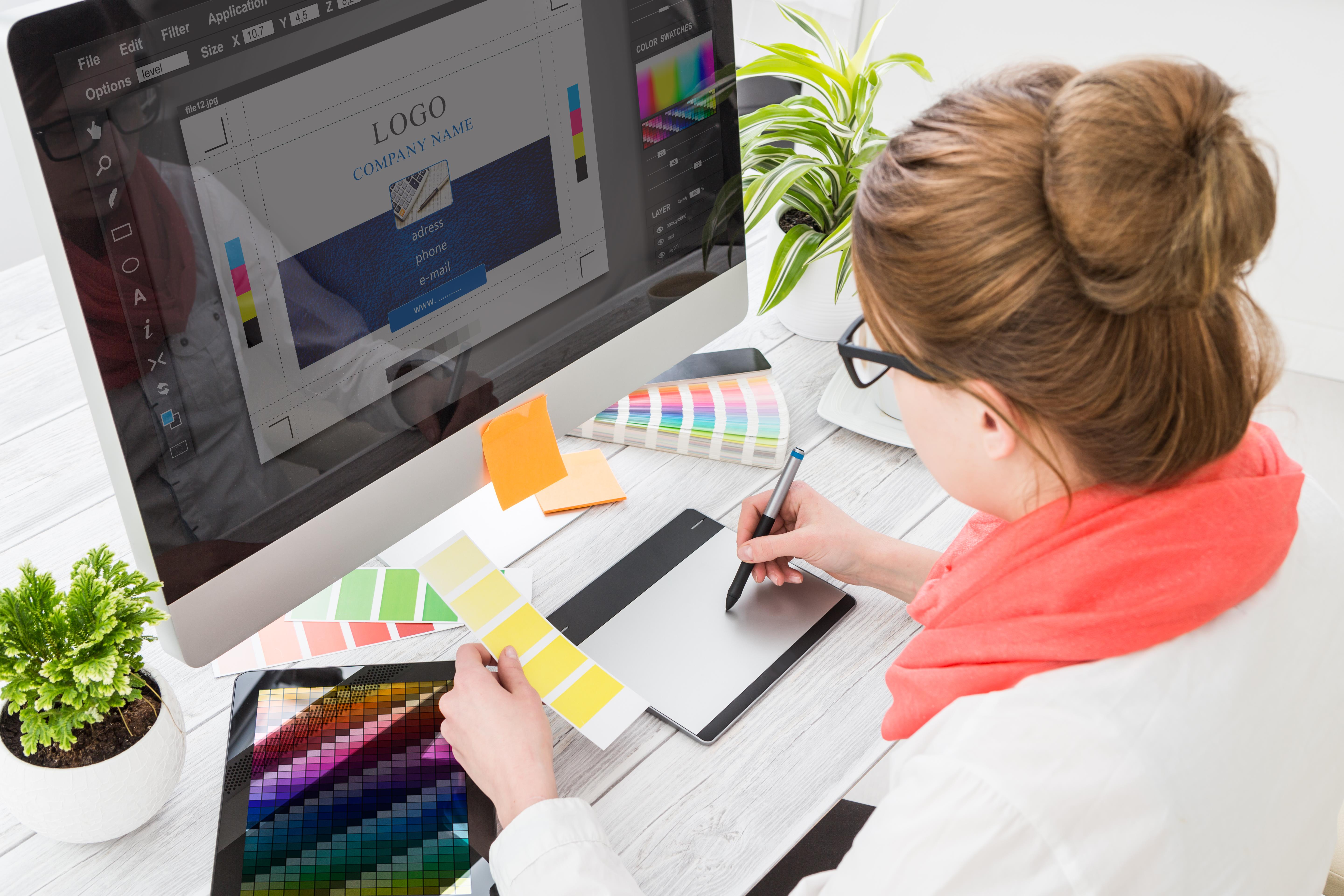
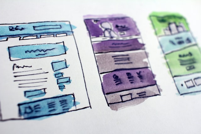
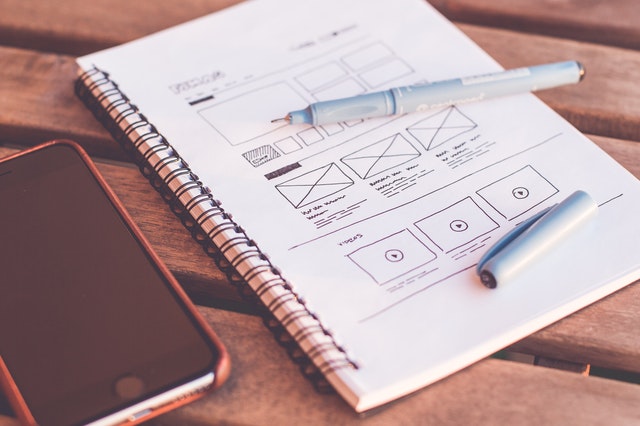
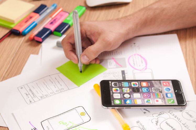
For this reason, it is essential to make sure that the navigation experience on your app feels effortless. The design should be – first and foremost – clear and functional; the buttons easy to find. Mobile applications often have complex interactions that need to be simplified for the user. Therefore, it is advisable to avoid tools such as Photoshop or Illustrator in the first stages of the app design, and start working on projects by drawing on paper instead.

Some practical tips…
In the Apple Developer’s Guide, there are some practical suggestions for mobile app designers: controls should measure at least 44 points x 44 points, so they can be accurately tapped with a finger, and text should be at least 11 points so that it is legible at a typical viewing distance without zooming. Colours, too, play a crucial role: while too many colours can be distracting or confusing, using different colours to emphasize certain elements is advisable. When choosing the colour palette, you should make sure that the colours are not clashing and that your text is visible in the background.
Finally, you should always consider the context in which the user interacts with your app: will it work in bright sunlight? Does the font work in multiple languages?
The devil is in the detail
While planning the design of your app, do not underestimate the value of the details. Users love apps which are not only easy to navigate but also beautiful. Elements as typography, empty space, and high-resolution imagery play a central role in the user experience: your font should be both stylish and easy to read and you should make sure you are maximizing the space between lines without cramping the text.

Mobile App Design: iOS vs Android
Until a few years ago, designing only for the iPhone was the rule, today there are multiple devices and platforms that must be taken into consideration. Once you have designed your app, you will need it to work on a wide variety of devices and operating systems: on both iOS and Android at a minimum, and preferably even on the Windows platform. While some elements can be the same across all platforms, other parts need to be designed differently. For instance, iPhones do not have the “get back” button, so you will need to include a “back” chevron in the top left of the screen throughout the various journeys in your app. On Android, on the other hand, there is no need to design this specific feature.
With all the different models and makes of phones available you will also need to design for different sizes. A smart way to do this is to have three sets of graphics: high density, medium density, and low density, and to use them when needed.
Branding for apps
In order to maximize the effectiveness of your branding efforts, you will want to have consistent app design elements in everything from your logo, to your website, to your app. It is crucial to use a logo in the app header in order to increase brand recognition and to choose the colours of your design accordingly. When Facebook acquired Instagram, for instance, Facebook kept the famous Instagram camera icon, but changed the background of the app to the standard Facebook blue, thus maintaining brand recognition for both companies.
You should aim to make your brand so recognizable that when a user sees your logo, they will immediately think of your app.
In conclusion, good mobile app design is more than sheer decoration. Other than making your app beautiful, the high-quality design should organize the user interface purposefully, thus enhancing the usability of your product. In addition, mobile app design is a key element in your branding strategy and it should contribute to brand awareness and recognition.

Related posts

Motion Design: The Latest Trend in App and Website Design
Motion design applied to apps and websites has shifted from being a nice extra feature to something that’s become essential to grab the user’s attention. ...
The 8 latest UI trends (User Interface Design)
New lists of User Interface or UI trends emerge every year as the need to bring something different to customers continues to increase. Users visit ...
The 10 latest UX trends (User Experience Design)
Nowadays, a website without a well-cared user experience is like a light bulb without light. Therefore staying updated on the latest UX trends is crucial! ...
Mobile App Design: usability and user experience
In the development process of applications, we come across two other essential characteristics besides functionality: usability and user experience, both part of the mobile app ...
App Design: the importance of fonts in mobile design
Discussing mobile design entails talking about the structure or backbone of the app itself. It’s something more than a hull at the mercy of the ...
When it comes to how to design an app… Avoid these mistakes!
The app development industry has been growing exponentially in recent years. And − as a result of this growth − the number of jobs related ...
App design, why it matters to users and how to do it
By the time we start planning our future application we think of everything that the user needs, how we are going to introduce it, how our application ...
How to design m-commerce applications?
Mobile devices are increasingly present in our daily life and activity, to the point of making purchases from them. Indeed, m-commerce applications have had a ...
Screen, colours and typography: basic elements in apps design
The success of a mobile application depends on many factors which can be controlled with work and effort. In this sense, the design of mobile ...