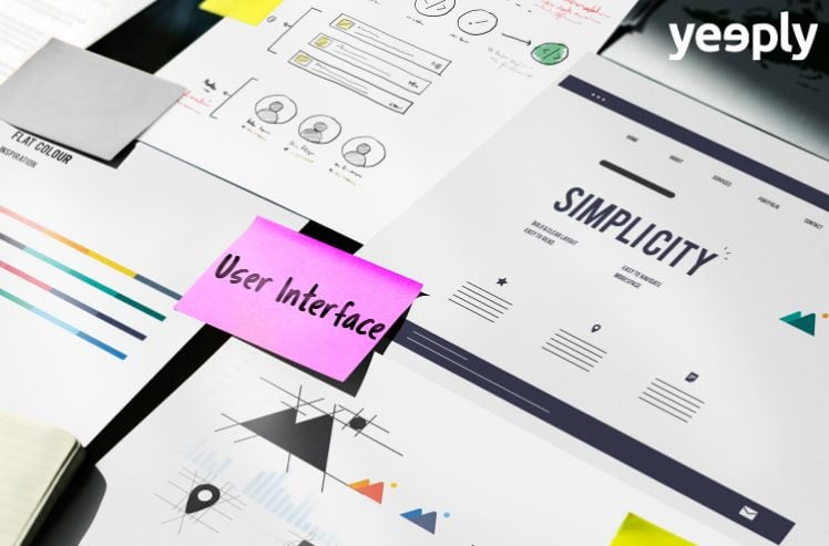
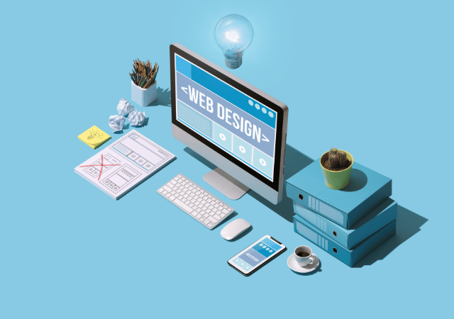
Your website is your digital cover letter. If you are thinking about overhauling your website, you are most likely to be keen on incorporating a stunning design. For this reason, Yeeply has selected 5 websites that share a common attribute: a surprising user interface. We’ll be discussing the latest trends in website design to help you find inspiration for your new website project.
5 websites with an impressive UI

When it comes to website design, browsing the internet is the best possible way to find inspiration. However, it’s easy to get lost in the immensity of the digital ‘ocean’.
You can browse websites mustering web development professionals to look for some references and see where the newest design trends are headed towards. Websites like Behance, Dribbble, or Awwwards showcase the latest trends in user interface design and website development.
We’ll now select 5 designs with a surprising user interface for you. Let’s bear in mind that not all of these examples can be used for all kinds of websites. However, you can borrow ideas from them that you can then incorporate into your website design project. Are you ready? Let’s begin our review.
?? You might be interested: Custom Web Design vs Website Template
#1 Wickret
Wickret is the landing page of the namesake mobile banking company, which operates in the US, sets no bank fees and helps its clients save money in a smart way by using intelligence artificial (AI). It’s unmistakably not the typical example of traditional banking, so its website could not be the typical bank website either.
Its attractiveness lies in its light backgrounds and the contrast of vibrant colours with pastel tones. But beyond this first impression, what’s a real surprise is the circle that surrounds the pointer and activates actions when moved around the screen: the colours of the titles change, background elements move, and gifs appear when placing it on the benefits box…
Its motion design elements make navigation attractive and — despite this — the website manages to remain simple and intuitive whilst enticing you to download the app to test the product.
#2 Cobo
Cobo, a world leader in footwear plastic injection moulding, is quite an example of originality when it comes to user interfaces. Innovation is one of the company’s main characteristics, so its website was not to be found in contradiction with this fact.
Its homepage already has something quite unprecedented: it features a jellied mass that reacts to mouse movement and clicks. And the navigation through the website’s different product sections doesn’t fall behind as to design freshness. As the user scrolls through the website, the images get coupled to end up forming a sports shoe. The site also incorporates small animations when the user expands elements of its image gallery.
This is a website that has been designed to impress its users. It’s something that may not fit in well with all kinds of businesses but that’s undoubtedly associated with innovation and being a cutting-edge firm.
⭐️ Recommended reading | Cost of a website: how much does it require to make one?
#3 Collage
Collage is a contemporary product design online store. In it, you can create original and unique objects — ranging from decorative and functional accessories to jewellery — by experimenting with different materials, shapes, textures and colours.
Its focus on product design also gets transferred to the company’s website. Collage’s customers greatly appreciate a product’s design, so the company is clearly committed to offering a ground-breaking navigation experience, which incorporates movement to texts and images, large fonts and a daring colour palette (with a high contrast to render it readable nevertheless).
Beyond the beauty of their products, this online store manages to convey the concept of innovation and quality through its user interface. It’s a perfect combination of branding and web design.
⚡️ Also interesting: The best examples of digital branding in tech companies
#4 Discovery Land Company
The Discovery Land Company specialises in building luxury residential complexes with private clubs and resorts all around the world. Locations and surroundings are decisive in this company’s industry; hence images are paramount in its website: it features full-screen background videos, images that may be enlarged by clicking on them…
Revolving around the idea of exploration, the traditional pointer has been transfigured in this website into a compass card. This example of website design offers more conventional navigation and includes a superior menu and an alternative ‘hamburger’ type menu. Despite this, the images portrayed by the website are quite spectacular and make you want to have some extra zeros in your bank account to enjoy one of the lodgings offered. Wouldn’t you agree?
#5 Rogue Studio
The best way to demonstrate how disruptive a user interface can be is by creating it. Rogue Studio — a company specialised in branding and digital design — has a ground-breaking website that’s anything but traditional. It features a black background, very large fonts that incorporate movement when scrolling, and an original movement (click and hold) for loading new sections.
A vertical menu on the left, fonts that rotate as the user scrolls horizontally to move onto the website’s next section or the use of different colours to differentiate between projects, are just some of its hallmarks. Brands associated with innovation and companies that have creativity in their DNA can bet on websites featuring this kind of user interface.
? You might be interested | Web creation: 12+1 Questions to ask yourself before developing a site
Trends in user interface
Now that we have discussed several examples of novel user interfaces presently in use, let’s have a look at some common aspects that have become current trends:
- The prominence of fonts. Combining sans serif fonts with serif fonts in headlines has already become a design must. Outlined fonts which are filled in when you hover over them with the pointer are another element that begins to show up more frequently in website design.
- Minimalism. It never petered out. And most importantly, designs increasingly aim at having more with less and bet on simpler websites in which images gain prominence.
- Motion design. Content micro-interactions and animations aim at surprising the user and increase engagement with the website.
- Liquid and fluid effect. 3D movement — as in Cobo’s homepage — or elements simulating liquid stains bear witness to this current trend in user interface design.
Are you ready to create a TOP-NOTCH user interface?
As you may notice, website design is constantly evolving and there are always developers out there who manage to leave us with our mouths open. If you are among those who want a website with an impressive user interface, you can rely on Yeeply to get it done.
We have the best certified professionals, whose experience spans across many projects and who are ready to start working whenever it suits you best. If you are looking to AMAZE your users, stop looking. Get in touch with us and let Yeeply’s website development experts do their magic.
Related posts
10 Best Web Development Examples That Are Changing The Game
Back in the early days of computers, setting up software was a big task that had to be done one computer at a time. Nowadays, ...

Everything You Need to Know Before You Hire a Full-Stack Developer
A Full-Stack Developer is a professional trained to take charge of a technological project, from the beginning to the end and in a fully autonomous ...

The most popular Programming Languages for developers in 2023
Programming languages have become a basic tool for any sector. There are hundreds of different languages, each with its own rules. However, within all this ...
Custom Web Design vs Website Template
When you consider creating a new website, you will soon be faced with an important dilemma. Are you going to bet on an existing website ...

The Fastest and Safest Way to Hire a Web Designer
Although it is very common to hire the services of a web designer, many startups and SMEs have doubts when it comes to hire this ...
Ecommerce Website Design and Development for WordPress and Woocommerce
Online stores were already popular, but they have become even more relevant since the coronavirus crisis. Ecommerce has become a lifeline for many physical stores ...

WordPress Plugins: Design a Website Without Typing in any Code
WordPress has become one of the most widely used content management systems (CMS) across the world. It may have detractors but the truth is that ...
How to Create an Online Shop: Follow These Steps to Get Started!
Let’s say you have a business project in mind and are eager to make it come into being as an online store. The first thing ...
Keys to Creating a Successful International Website
Has the time arrived for your business to go international? That’s great! The next thing to take into account is optimising your website for different ...

Custom Web Development for Ecommerce
No matter if your company is B2B or B2C, it is not enough just to have a website. Customers are looking for a user-friendly experience ...