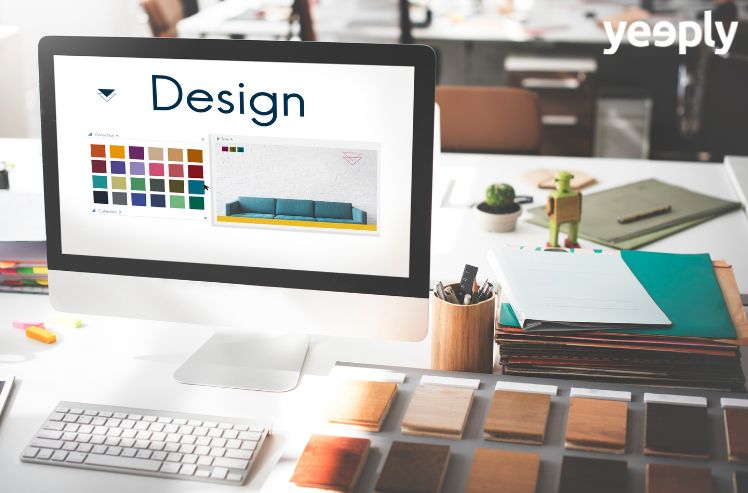
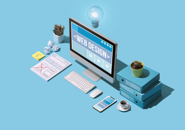
Even though we know a lot about creating a website, our knowledge about web design is often very limited. In this article, we will particularly focus on colours in web design.
In previous articles we were talking about topics such as e-commerce, creating a good corporate website and helpful website development tools. In this post, we’ll explain the importance of colours when creating a new website.
When talking about colours, it’s obvious to think of a rainbow. There are primary, secondary and tertiary colours; cold and warm tones… Their variations are countless.
It’s not possible to quantify the number of colours that exist and their many classifications. Although numerous studies were carried out that prove the psychology of colours and how to apply them depending on what goal to achieve.
Colours evoke feelings, ideas, thoughts. When creating a web design, the developer must be clear about the values that the company he is going to work for wants to transmit. Corporate identity is vital in business and colours play a determining role in it.

How do colours influence web design?
First, you have to find out what the psychology behind the colour is. There is a study that includes a detailed analysis of the effect that colour has on human perception and behaviour. Besides influencing people’s feelings, colours are responsible for many of our actions.
Depending on the colour that we perceive on a web page, for example, we either continue to visit it or leave it quickly. It will serve as an impulse to buy a product or, on the other hand, to not pay attention to it.
When creating a website, the developer should advise you on the associations that people make with each colour tone. The visual stimuli greatly affect our brain, and therefore, the use of the right colours for a website is essential.
Colour psychology can strengthen your business. E-commerce sales and visitor numbers will increase if you use the correct colours. Besides that, it can serve as a tool to attract customers and strengthen your brand identity.
You might be interested | Growth Driven Design: the Approach to Get the Most Out of Your Website
Web design in terms of colour psychology
If a developer knows what influence colours have on human actions, he can use this knowledge to encourage certain actions. Therefore, in the following section, we will introduce you to different colours and their psychologies.
The psychology behind the colour blue
Let’s start with blue, as this is the colour that determines Yeeply‘s corporate identity. Blue shades are associated with the following attributes: quality, efficiency, reliability, strength, productivity, confidence, wisdom and security.
Blue is also perceived as a masculine colour. The best example of this is baby clothing. If the baby is a boy, clothing is given in blue, but if it is a girl, most of the clothing given is pink. Since blue is perceived as a cold colour, the user should not be overwhelmed with this colour. In the same way you shouldn’t use too many strong colours.
Since blue tones are associated with reliability, they are used by many large companies in the health, technology, science and banking sectors.
The psychology behind the colour red
When you create a website and focus on web design, red will always come to your mind. It’s one of the shades we name first when we talk about colours.
Red is the colour of passion, for better or for worse. It conveys happiness, closeness, strength, aggressiveness, life, emotions, movement and energy. Red is also associated with bad things like war, violence and danger, as well as all prohibitions.
The colour should be used to attract the attention of visitors to your site. You can generate interest with red. We recommend using the colour tone for websites in sports, food, fashion, marketing or emergency services.
As with blue, it should not be overused. It’s a warm colour and when there’s too much emotion, it can be a counterproductive effect. It is not recommended to use the colour for websites about environment or luxury.
The psychology behind the colour green
Green is considered as the colour of hope. It conveys the impression of calm, harmony, growth, fertility, money, health, peace, happiness or naturalness.
Some say that green is one of the best-processed colours in our eyes. It is a neutral tone, not cold like blue or warm like red. That’s why green tones communicate security, relaxation and peace.
Green is the best choice when we want a web design for science, tourism, medicine, sustainability or environment. Like red, it is not recommended to use when we want to sell luxury products. However, if your website talks about nature, your corporate colour must be green and its various shades.
Related content | Growth Hacking: Strategies to Optimise your Web Conversion

The psychology behind the colour yellow
Red, blue and yellow are primary colours. Yellow is the lightest colour of these three and associated with joy, happiness, friendliness, optimism, creativity, wisdom, spontaneity and concentration.
You should be careful when using yellow because not all meanings are positive. Yellow also stands for warnings, envy, jealousy, insecurity, cowardice and deceit.
When designing a website, strong shades of yellow can be used to transmit happiness as mentioned above. Even softer tones of yellow can be used for smoother bliss.
Yellow is equated with research and understanding. But if we don’t use it wisely, it can be intrusive.
The psychology behind the colour pink
Pink can be considered as a tone of red, but its associations are different. Pink is usually associated with femininity. It transmits kindness, affection, love, protection, surrender, generosity, innocence, delicacy, creativity or sincerity.
Unlike red, pink cannot be associated with anything negative. We suggest to use it for websites that are dedicated to women, selling products for girls and teenagers, sweets or fashion.
The psychology behind the colour orange
If you want to convey fun and friends, you should use orange tones. They express energy, life, ambition, heat, emotions and enthusiasm. Also warning or danger depending on the context.
Regarding e-commerce, orange is an often-used colour because it attracts the attention of potential customers. It’s also a good alternative for websites in the automotive, technology, leisure and entertainment sectors. We don’t recommend to overload your website with orange tones as this can be annoying, as with all colours mentioned.
The psychology behind the colour white
This is a colour that, when used on a website, communicates values such as friendliness, purity and innocence, peace, modesty, cleanliness, goodness, honesty and security.
White is associated with clearness and perfection. Thus, the colour is widely used in medicine, nursing, dentistry and all areas of health. White can also be used on websites about technology, science and fashion. It is often used for luxury brands and boutiques.
The colour should be combined with other colour tones, and the use of white does not cause problems. However, you should be careful not to use too much white as this could indicate numbness or emptiness and missing content.
The psychology behind the colour black
Many theories say that black is not a colour. It’s rather the case that black is the absence of colours. Either way, black is associated with elegance, strength, precision, power, intelligence, stability, sensuality, youthfulness, authority and correctness.
Not everything it conveys is good because black can also be associated with darkness, death, evil, bad luck, mystery, filth, rebellion, prohibition etc.
Black can help in creating a modern and elegant website. It’s widely used in marketing, fashion, luxury and cosmetics.
Be aware that you should be careful with its use. Because if there’s too much black on a website, it’s ominous or bad, scaring visitors and making them feel uncomfortable. It’s better to combine black with other colours and choose multiple shades.
The psychology behind the colour grey
Grey is a neutral colour with great value if you know how to use it well. It is associated with: professionalism, sophistication, luxury, balance or timelessness.
In case you want to develop a website for luxury products, grey should be your main colour. Also for professional sites or websites that want to express calm and seriousness.
Sometimes the colour can be dull or boring. If we exaggerate it with grey, the website quickly becomes lacking in personality. Keep in mind that this colour does not attract attention.
This list has shown you colours you should consider when designing your website. Of course, there are many more colours than we could analyse, but here we have listed the most commonly used colours.
If you still have questions about web design and the right colour for your website, you’ve come to the right place. At Yeeply we can help you out because we have experts in web design. We are happy to plan your project with you!

Related posts
10 Best Web Development Examples That Are Changing The Game
Back in the early days of computers, setting up software was a big task that had to be done one computer at a time. Nowadays, ...

Everything You Need to Know Before You Hire a Full-Stack Developer
A Full-Stack Developer is a professional trained to take charge of a technological project, from the beginning to the end and in a fully autonomous ...

The most popular Programming Languages for developers in 2023
Programming languages have become a basic tool for any sector. There are hundreds of different languages, each with its own rules. However, within all this ...
Custom Web Design vs Website Template
When you consider creating a new website, you will soon be faced with an important dilemma. Are you going to bet on an existing website ...

The Fastest and Safest Way to Hire a Web Designer
Although it is very common to hire the services of a web designer, many startups and SMEs have doubts when it comes to hire this ...
Ecommerce Website Design and Development for WordPress and Woocommerce
Online stores were already popular, but they have become even more relevant since the coronavirus crisis. Ecommerce has become a lifeline for many physical stores ...

WordPress Plugins: Design a Website Without Typing in any Code
WordPress has become one of the most widely used content management systems (CMS) across the world. It may have detractors but the truth is that ...

How to Create an Online Shop: Follow These Steps to Get Started!
Let’s say you have a business project in mind and are eager to make it come into being as an online store. The first thing ...
Keys to Creating a Successful International Website
Has the time arrived for your business to go international? That’s great! The next thing to take into account is optimising your website for different ...

Custom Web Development for Ecommerce
No matter if your company is B2B or B2C, it is not enough just to have a website. Customers are looking for a user-friendly experience ...