In app design we shouldn’t only be taking into account our app’s user-friendliness, its effectiveness and the style of our company’s branding. We must also consider the use we make of colour − an aspect that will instantly and involuntarily cause an emotional and subjective reaction on the mobile user.
By this, we generally mean our app’s colour palette. This will depend on many factors and sometimes also on the kind of app and/or business behind the app.
There are countless studies on how the use of cold or warm colours entails different influences. It’s a discipline that has been very much discussed in the marketing area. This time we would like to go further and see what importance colours have when it comes to apps. Let’s get started with the first impressions.
What colour should my icon be?
We can find apps in the stores with icons of all colours, though some of these colours are more prevalent than others depending on whether it’s a social app, a game, etc. As you may see here, Medium has undertaken a very intense research study consisting in comparing the icons of hundreds of mobile apps.
So, what colour do I choose when designing my app? This analysis we’ve mentioned comes to the conclusion that it will always depend on the app itself, on what it does and what kind of target user it’s aimed at.
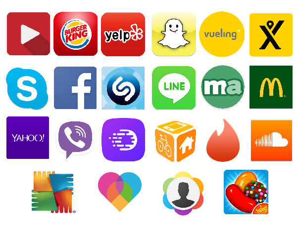
If you’re somewhat conformist and want to follow the current trends in app development, go then for blue or red. If you want to differentiate yourself, green is your colour; it’s less common than blue and red but still poses a minor calculated risk. However, if you want to be a rebel and do something that nobody has done before, let pink or purple − which are colour schemes that are downright underrepresented in the stores − be your colours of choice.
The meaning of colours
All this said, choosing the right colour is not just a matter of aesthetics or following the current trends in app design. We must remember that colours have deep implications when taking part in communication and that each colour conveys a different meaning. Let’s see what each colour entails and how this relates to some examples of successful apps.
- Red: it implies a call to action, urges to do something, whets the appetite and symbolises passion, love, etc. It also encourages being impulsive by creating a sense of urgency.
- Yellow: it represents happiness and transmits optimism.
- Blue: it conveys serenity and peacefulness to the customer/user and boosts productivity. It generates a sense of security and confidence.
- Green: it’s associated with nature, tranquillity and health. Although it has a strong link with wealth and may even stand directly for money, in marketing it’s used to calm customers down.
- Purple: wisdom and success. It’s usually used to embody creative and original brands.
- Orange: it manifests excitement and enthusiasm and thus its use is limited to calls to action and generating leads and impulse purchases. However, all this without ever failing to convey a sense of reliability.
Colour in app design by sex
In addition to the fact that different colours convey different things, we must also take into account our target user’s sex. Men don’t communicate the same way as women do, so the message delivered by the design of the app we have in mind should take this into account.
What colours do you like best?
Blue is the favourite colour for 57% of men, green for 14%, black for 9% and red for 7%. Purple is clearly missing when it comes to preferences here, even if it’s a colour that’s related to success as previously discussed. In fact, 22% say it’s the colour they like the least.
Purple, however, is the favourite colour for 23% of women. It comes second to blue, which is the favourite colour for 35% of females. They tie with men on green (14% of women have it as favourite) and 9% of them love red.
Nevertheless, something on which both men and women agree is that their least liked colours range between brown and orange. And blue is second to none no matter what.
As for perception, the study carried out by HubSpot also reveals that men prefer bright colours while women lean towards soft and pale colours. And along the same lines, males prefer darkened or shaded colours while females prefer lightened up and luminous colours.
App design and colour blindness
An aspect that is very often not considered is that almost 9% of the total population suffers from colour blindness. This condition affects directly the ability to distinguish between certain colours. If we do the maths, we may be losing nearly 1 out of every 10 users who download our app if we fail to adapt our app’s design to them.
How can we fix this?
Colour blindness is not about seeing in black and white, it’s rather about not being able to distinguish between certain colours that are similar. For example, a colour-blind person will not distinguish between the brown, orange and yellow tonalities of a tree’s leaves in autumn. They will all have the same colour to a colour-blind person.
We often focus on elaborating designs that make use of a limited range of colours and play around with slight variations. And that’s fine. But we should also keep in mind that for some people this approach is anything but user-friendly.

How can we adapt our app’s design? You can conceive a standard design that can be used by the colour-blind user. If you don’t want to get yourself boxed in, you can offer this kind of user an alternative consisting of a version optimised for a sharper colour distinction:
- You may include additional patterns: overlaying patterns to colours is a good idea because it helps in distinguishing confusing colour gradations.
- Another option is creating a brand-new alternative design: this may require changing the background and the colour range of the entire app.
One way to tell if you’re optimising your app’s design for colour-blind users correctly is to see how it looks like in a grey-scale. Designs with similar saturation levels and tonalities will be indistinguishable. But those different enough will be distinguishable in a grey-scale.
Conclusion
Colour in app design may, in fact, be important to catch user attention at first sight. And it can very likely even generate a certain level of engagement by itself. We must, therefore, take colour into account so that it matches our brand, our target user and our app’s main purpose. However, user-friendliness should still be above all this when it comes to app design.


