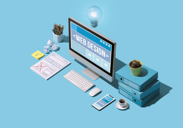
Website user-friendliness is becoming increasingly important by the day when it comes to a website’s eventual success. We could say that user experience is well-rounded if content and design meet the user’s needs.
It may seem easy when putting it like this. But do you know how to achieve this? In this article, we’ll be giving out some tips on improving user experience (UX) that you’ll be able to apply to your own website and make your users fall in love with it.
What exactly is website user-friendliness?
Website user-friendliness refers to the ease with which a user is able to browse a website. No more, no less.
In order to achieve a good user experience, a website’s navigation must be simple, intuitive and fluid. If a website takes too long to load or users can’t find easily what they are looking for, it will scare them off and they’ll leave it — being quite unlikely for them to return.
When discussing user-friendliness and easy navigation, we have in mind both a website’s visual/design aspects and its contents. Having a good design is of little use if the website’s texts are excessively long or are written in a way that is unappealing for its target users.
Please pay heed to the following if you have doubts about how you can improve the user-friendliness of your digital project’s website.
You might be interested: Top 5 websites with an impressive user interface (UI)
10 tips to improve website user-friendliness
If your e-commerce site’s sales are not what you expected, or Google Analytics shows a very high bounce rate and an elevated number of visits that never return, there is probably some aspect related to website user-friendliness that you can improve.
You can use tools such as Hotjar or CrazyEgg — just to name some examples — to see what path do your visitors follow when browsing your website.
However, let’s have a look at what website elements usually need improvement before resorting to external tools.
Leave spaces in blank
Not leaving some spaces blank is a basic design error — both in traditional graphic design and in website design. Don’t be afraid of blank space. It comes in handy for giving importance to the main message and for structuring content.
Filling your website with text to the brim will not improve its user-friendliness. However, the good use of elements such as padding (used to space an element from within) or margins (used to separate the website’s elements) will help to channel the user’s attention on what’s important, as well as enhancing readability.
The menu is always accessible
We tend to think of the website’s “home” section as the most important one by far, but is it really so?
Well, it depends. Examine on Google Analytics how users land on your website. You may discover that there is a well-positioned section that’s responsible for a good share of your traffic. How is that section’s navigation conceived? Can the user access the rest of the website from there?
Sometimes the website’s menu does not appear in every section, which is a major error. A user must be able to navigate throughout a website from any of its sections. Therefore, make navigation easy and include your website’s menu throughout its sections.
Read on: The 10 most common web design errors you can avoid
Innovate, but don’t overstep the mark
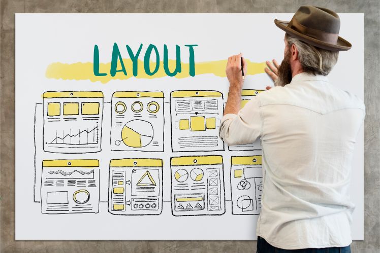
Don’t get us wrong, we know you’d like to have a website in line with the current trends. But even if your UX design meets the current trends, its result can’t be confusing for the user.
Your website may incorporate new elements such as micro-interactions, but its elements should never be disorienting for the user.
A properly recognisable website menu located at the top, the website’s logo at the upper left or the subscription to the newsletter at the footer… These are all conventions that are already in the user’s DNA. You can innovate in your website’s appearance but it is best if its basics and core structure remain unchanged.
Organise data hierarchically
Haste and rushing are among the evils of the 21st century. And even more so when it comes to the internet. That’s why you should make browsing and navigation easy for your users.
Reading will be easier if you use readable fonts and H1, H2 (and subsequent) headings or bold text.
There will always be users who devour your texts. But the laziest or busiest need to find an answer at a glance. Remember, thus, to organise your content hierarchically and use visual elements such as bullets for listings.
Drop-down menus are another option that works well to list features or show the answers to frequently asked questions. Users will see the title and will click on the drop-down element if they seek more information, getting to know more without reloading the website.
Optimise loading speeds
We have already talked about haste and rushing. If your website takes over 5 seconds to load, consider yourself lucky if it gets any visit.
Optimise your website’s loading speeds, both for its images and visual elements as for its code and resources.
If you’re not sure about which aspects you should be improving, you may obtain information about your website and how to solve its potential performance problems with tools like GTmetrix or Lighthouse.
Highlight links
Once again: make it easy for the user. If a user has to click on a link, he/she must notice right away. Highlight hyperlinks with bold fonts or with a colour that’s different from that of the other parts of the text. Underlining them is also a common practice that is still widely used.
Use images (well)
The first impression that a visitor gets when landing on your website will be essential when deciding whether to continue to browse it or simply leave. For instance: if your website has a large header image, it is better that you use an image of your own rather than a stock image.
You’ll be able to connect with your user much better if you use your own images. Use images strategically, laying them in key places where they can help the user take a break from the text. Icons highlighting features can also help the user identify the relevant items and organise information hierarchically.
Related content | Growth Driven Design: the Approach to Get the Most Out of Your Website
Reduce 404 errors to a minimum
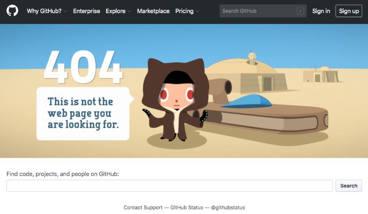
Pages that are not found can be quite frustrating for the user. You should check this regularly and minimise the possibility of this error taking place.
However, since 404 errors end up being inevitable, at least make it a pleasant experience: offer valuable content, apologise and invite the user to carry on browsing your website.
Look after the mobile version
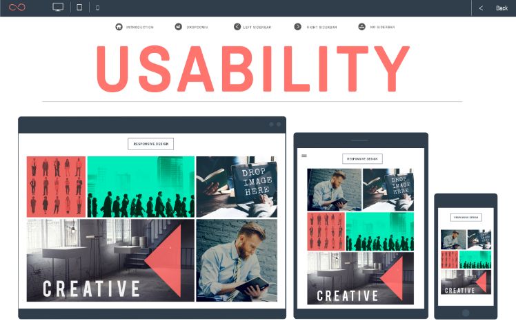
The website’s mobile version is currently the most important one for search engines. You must not neglect it. Make sure everything is in place and that none of its items is inaccessible from smartphones, as may happen with certain buttons or texts that are too small.
Simplify searches
Place the search bar in a well-visible spot. Remember what we said about haste and rushing. If users don’t find what they’re looking for at first sight, they’re likely to search for it. Look after your users’ search experience.
Avoid making the user angry
These are some of the aspects that annoy visitors: irrelevant videos or animations, annoying pop-ups, disarranged content, etc. But, however pressing your need to earn leads may be, your website must be like a stall that entices its users through persuasion and not one that “hollers” its products at them. You must have a website that is pleasant to visit. Once you achieve this, the rest will follow.
Obtain a top-notch UX design
Concerned about website user-friendliness and looking for an expert in user experience? If this is the case: Welcome to Yeeply! We have the best professionals in UX, who will develop a website designed to impress your users. If you want to know more about what we can do for you, please get in touch with us.


