In this blog spot trends in app design over the first half of this year, so that anyone who has started a project recently, has the resources to capitalise on them.
Now in 2016, we see new trends in mobile app design that must be taken into account when venturing into new design territory, and as always, Yeeply will show you the ropes.
The Importance of app design
A clear example of the value of app design is the gigantic Google. Everyone with a mobile device will have noted the umpteenth change in the appearance of the company that knows full well the importance of keeping the appearance of all its tools well maintained. The US giant, the big G, has decided to change the icons of some of its most important applications.
The changes made by Google in its app design (for now) only affect apps related to Google Play. The first to feel the change has been Google Play itself, the design has changed to accentuate the outlines of the existing Google triangle and it eliminated the white background. The other icons have undergone changes to the triangle as shown.
New trends in app design
“If something ain’t broke, don’t fix it” This is very valuable advice in normal life however you can forget it when it comes to app design. In a world of constant evolution it is better not to be outdone, as this can be the first step towards the decline of the project.
It is true that trends come and go quickly, but already by the middle of the year we can outline the ideas that apps in the market have for their appearance. Here we can tell you what works, the rules of the game so to speak, so that your app design is at the top of its game.
Here we highlight some of the trends that are prevailing in apps so far this year
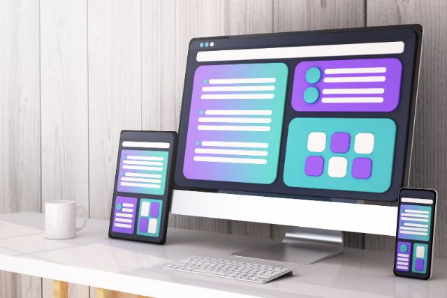
Simpler colour schemes
The commitment to the simplicity in app design we discussed above, took hold in 2015 and became really important last year. For this year there has been a further revolution, users today prefer a mixture of more subtle and simple colors. Although low saturation colors are more on trend than bright and flashy colours, it makes sense to use the colors of your brand.

The movement innovation
The use of bright colors, large images and types of clear and concise fonts is rising, therefore designers must make themselves stand out in some other way. We believe that focusing on innovative movement can be a good way to do this. This trend is booming! In webdesign as well as in app design the use of interactive scrolling, rather than clicking, has seen a huge rise. There is some discontentment caused by the difficulties encountered in navigation, this may be caused by the quantity of links on your screen, therefore focusing on innovative movement within your app design allows easier navigation for visitors and improves the appearance of your app and user experience.
Conscious app design
An application is considered conscious of its context when it has mechanisms that allow it to collect, process and use the user’s data in order to provide a better service. This is a function used in mobile applications to identify where the user is using an application and how that can affect what it does. These “conscious” applications effectively differentiate between types of context such as location, identity, activity and time. For example conscious applications can present the user with relevant content by the location in which it is located.
Flat design vs skeuomorphism
The trend that is emerging now is what is called flat or layered design or, as Google calls it, material design. This aesthetic can be found in flat design, but with some borrowed ideas of skeumorphism. With flat design the elements are layered but with material design they remain geometric in nature, with blocks of color instead of natural textures. But as in the skeuomorphic design, material design borrows metaphors from the natural world: how they move and interact with each other objects, shadows and other effects of light.
As a result of this merging of flat design with natural physics, the user has a more intuitive understanding of how the elements work on the screen. Objects have weight and inertia when we manipulate, simulate or offer resistance, when they slide across the screen, or cast shadows on the elements that are under them.
This layered design brings together the usability of skeumorphism with flat design aesthetics to create an elegant user experience.
Typography
In recent years, both iOS and Android have been working on optimizing their operating systems for smoother, scalable and readable fonts. With the arrival of big screen devices, designers have typography in mind with the objective that this transmits beauty and expression in app design. However the goal is not only ‘make it more beautiful’, it also seeks to improve readability and the user experience while maintaining the professionalism of the brand.

These are some of the trends that have been seen in the first 5 months of the year, some emerged years ago and others have just arisen. Over the remaining months of 2017 it will be exciting to see how some of the trends we have discussed are maintained and others fall out of fashion. You already have some ideas about app design to start a new application project, now all you need to do is get started!

Related posts
10 Best Software for Android App Development: Top Picks for 2024
Developing mobile apps can be a challenging task, especially when it comes to choosing the right tools. Knowing the best software options for Android app ...

Android App Development Services: Boost Your Mobile Strategy Today
Looking to create a standout application for the Android platform? Android app development services are the go-to solution for businesses and individuals aiming to design, ...

Top 10 Android App Development Agencies: Leading Innovators of 2024
Choosing the right agency for your Android app development is crucial for your success. In today’s fast-paced digital landscape, having a robust and user-friendly Android ...
Deep linking in Android and iOS applications
In the last months, we have been talking about internal links. And although they’ve been in the app world for a long time, and much ...

Mobile App Security: Definition, Key Features, Tools & Tips
In the digital era, where mobile applications are everywhere, mobile app security is probably one of the most critical topics in the mobile industry. As ...
How Much Does It Cost to Create an App in 2023? Guide to App Development Costs
In the digital era, mobile applications are fundamental to engaging a tech-savvy audience. Understanding how much does it cost to create an app is crucial ...
Unveiling the Secrets of Mobile App Platforms: Best Platforms, Trends & More.
Have you ever wondered why the same app looks or acts differently depending on the phone? Well, that is the magic (and sometimes the mischief) ...
Responsive Web App vs. Native Mobile Apps: a Technical Comparison
The implementation of techniques of responsive design (or responsive web design) is located in the center of companies’ digital strategy and applies to all types ...
The Key to Efficiently Create “No Code” Apps Without Programming
In the digital age, creating apps without programming is an increasingly accessible task, thanks to different no code app platforms and no code web application ...

Everything You Need to Know Before You Hire a Full-Stack Developer
A Full-Stack Developer is a professional trained to take charge of a technological project, from the beginning to the end and in a fully autonomous ...