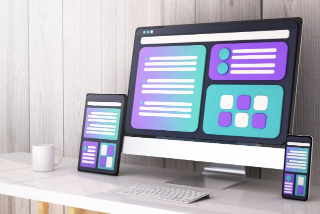
You must surely have by now an idea for a ground-breaking fantastic app that has certainly a huge potential! But we have to tell you something before it gets launched to the market and even before you start working on its development. On top of having a good mobile app design – a brand-spanking new design in fact – you also need to create the perfect app logo!
The first impression also matters in app design
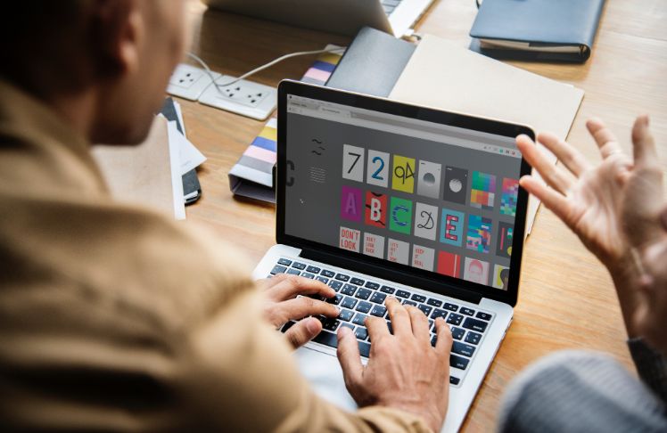
It’s well known that first impressions cannot be changed. In real life, we know at a glance whether we will like someone or not, whether we will like a piece of clothing or not… Even if such opinion may change afterwards – even in a radical fashion – the case is that the first impression usually prevails. And quite frequently it makes us rule out things that we would end up liking very much indeed. It’s a matter of how the ‘product’ is presented or introduced.
Mobile apps can also incur this kind of error. However, it can be easily avoided. And by avoiding it (i.e. improving the app’s aesthetics) we will foster an increase in downloads and user retention. Do you need specific reasons? Well, here they come:
- A good logo design prompts the feeling that the app is a quality app.
- When faced with bad logos or poorly designed logos users just pass by.
- An attractive logo encourages investigating a mobile app further.
We hope to have convinced you because a study entitled “The Science Behind Mobile Design” carried out by True Impact and Plastic Mobile has measured the importance of having a good logo, a good app design, and high user-friendliness to retain users and make an app become a successful app.
10 tips for designing the perfect logo
Well, the first thing to do is decide whether we want to have an excellent design or whether we will settle for a mediocre app. Once we take the leap into creating an app, let’s make it the best possible one! The journey begins with defining the app’s design and creating the perfect logo. We would like to share some tips so you can attain this on your first try. You should take the following into account:
1. Carry out some research before designing
One of the great strengths that a good app designer should have is the ability to understand the current environment. In this case, this means becoming acquainted with whatever shows up in the app market and in design trends. Reviewing the last developments in the markets is essential to achieve this. It’s always wise to check the stores of all the different operating systems, as the design of an app’s given version will vary depending on which device it has been conceived for. I.e. the icon for Android will not be like the one for iOS.
2. Take the customer seriously
Perhaps the customer has a background in app design. However, chances are that he’s a complete novice in the field and has therefore relied on outsourcing his app’s development through a platform like Yeeply. But this lack of technical knowledge does not mean that he shouldn’t be paid attention to rather, on the contrary, we must take his requests seriously. The challenge comes when trying to combine a good, efficient and user-friendly design with the customer’s requests. Rest assured that it’s no small challenge. Do you accept such a challenge?
3. Design having a mobile user in mind
One of the biggest mistakes is to design or develop an app thinking exclusively on its design, on its development or on the customer’s requests. Yes, we must respect these points of view, but it’s rather the end customer or mobile user – the one who will be using the app – who we should have in mind. Drawing from this premise, we can adapt the app’s design to the mobile user’s preferences and offer something he’ll find attractive and appealing when he enters the store. This will encourage him to download the app, use it and keep it on his mobile device.
4. Leave details last
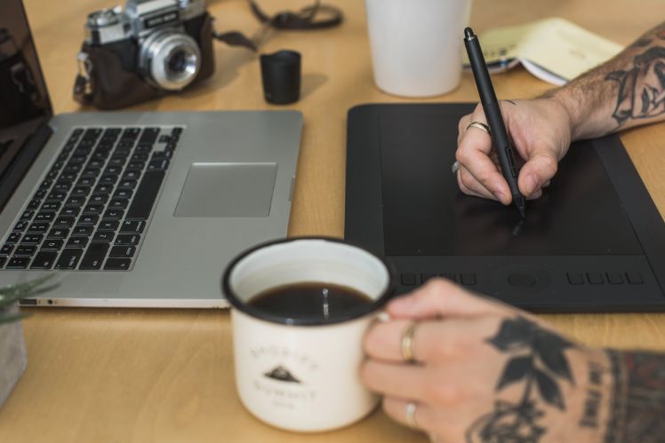
Sometimes we come across a situation in which we want to improve very specific details of the logo – and even details within the internal design of the application itself. However, to proceed in such a manner may prove counter-productive. If we start focusing on the details but then shift to the app’s central or main idea, focusing on the small details will have been of very little use. Yeeply recommends you to get started with the app’s general design and address the details later on when the main idea has already been defined. For example: define first a standard logo and then retouch it in greater detail to adapt it to the different application stores.
5. Sign complex designs away
Designers who have migrated to the mobile world may sometimes carry around previously acquired ‘bad habits’ with them. An example of this kind of ‘bad habits’ is to believe that complex logos and designs are better because they are more elaborate – something that is not necessarily true. In fact, it’s rather the opposite. Due to the small size of mobile devices, there is a need to simplify designs and conceive simple logos that make it quite clear which app they stand for at a quick glance. In short: logos that differentiate themselves and stand out from those of other apps.
6. Get your typographic choice right
Typography is essential in app design. Especially within the application itself, since it’s what the user will be paying most attention to when searching for something. We will have chosen badly if it’s illegible or makes our eyes get tired.
The fonts that fit app needs best are those with few edges and wide enough to be easily read. Using bold letters or of any kind that may seem artificial is not recommended. These should always grant a smooth reading. But as for the logo, we must avoid including any kind of text in it. We must make sure that the app’s logo or icon is self-explanatory.

7. Don’t make decisions based on current trends alone
Trends spring forth for different reasons such as users enjoying a given kind of design, for instance. Plain design became fashionable in apps because it brings simplicity and renders apps more intuitive. I.e. it was justified. However, we should not always be swayed by these trends.
Trends may sometimes play against our brand or our app. It’s very easy to find apps whose logo falls into some tonality of either blue or red and includes the app name’s initial letter in white. If we follow this trend when designing ours, how are we going to differentiate ourselves? Avoiding the main trends may, in fact, enhance our mobile application.
8. Something simple: something self-explanatory
As mentioned before, simplicity pays off. We will restrain ourselves from including too many colours, typographies or shapes. We must have simplicity in mind when creating an app’s logo.
9. A second opinion
Or several second opinions. Why? Because two heads are better than one, and three or four are yet better. Also, opinions are ‘different strokes for different folks’ as the saying goes, so they may be a way of testing whether the logo is suitable for different kinds of mobile users. We’ll even obtain ideas to improve it or to fix problems that we may not have noticed before.
10. Be inspired by what others do, but do NOT copy
You can always be inspired by millions of other applications that are already on the markets or by hundreds of websites about design that can be currently found on the Internet. Use them to explore new ideas but never copy these ideas. Remember that we should be different from our rivals in the industry in order to stand out and create a successful app. Furthermore, copying a design will only bring legal problems in the future.

