Nowadays there is no web app development project that does not include a mobile app development. And it is common to find gaps when creating web pages optimized for mobile.
Most of these common errors could be resolved by simply developing in Responsive Design (using the same HTML and URL for all pages of the site, adapting the content to the width of the device). But for web app development in Responsive Design it means, in most cases, starting the project from scratch. This is a luxury and an investment that few can afford today; it will be easier if we highlight how to do this from the beginning of the business plan.
This is where it comes to the specific web app development for mobile, where mobile SEO is an art and a specific area where it is very easy to make small common mistakes that can ruin all your efforts. We discuss in this in the following post.
Forget switchboard tags
These are the canons of mobile SEO, and we can count on the fingers of one hand the mobile websites (and professional) websites that actually know how to implement them.
Switchboard labels are:
The tag rel = “alternate”, which must appear on the page of the web desktop pointing to the URL of the mobile web that is its equivalent. For example; m.misitio.com/quien-soy must have the tag <link rel = “alternate” href = “http://m.misitio.com/quien-soy”>
The tag Rel = “canonical”, will appear from the mobile web, to the equivalent version of the web desktop. You instruct Google which is the original content and you will avoid any problems of duplication of content, something that Google hates. It will be something like; <Link rel = “canonical” href = “http://www.misitio.com/quien-soy”>
One of the things that you can also ensure is that Google will always show your Desktop version when the user comes from a PC or laptop and not the mobile version.
Consider the Googlebot-Mobile as much as the web desktop Googlebot
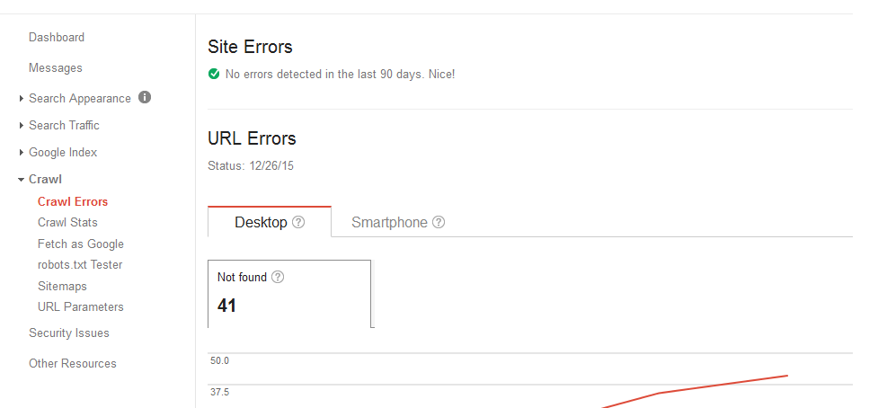
Even if you develop in Responsive Design, you have to check regularly that the agents of Google Desktop and Google mobile track your site correctly. You have a few free and simple options to see how they track and how they view your site as the Google Webmaster Tools.
When you use Google Webmaster Tools to look for common tracking errors, always remember to click on the “Mobile” tab. You’ll almost certainly get a nasty surprise and you will see errors exclusive to mobile that you had not identified. It has even happened to the writer of this post!
Searches on mobile devices are not the same as searches on PCs and laptops
The results of searches by users on a mobile device and a desktop computer are different and even give different results in Responsive websites.
When you search, the SERP (Search Engine Result Page) will be different on a mobile than a desktop because:
- Google uses the “context”; the search “where to eat” on a Tuesday at 2 pm in the center of Madrid will show results close to the user’s position, while the same search on a desktop PC can have more generic and distant results.
- The user, to perform the same search, can use shorter queries in mobile than in Desktop. In mobile, the Long-Tail is not as “long”. The user tries to shorten your search terms due to the sheer discomfort of writing on a mobile keyboard. Perhaps with Google Now and Siri this trend will change but at the moment the user does not have the ability to dictate their search to the phone.
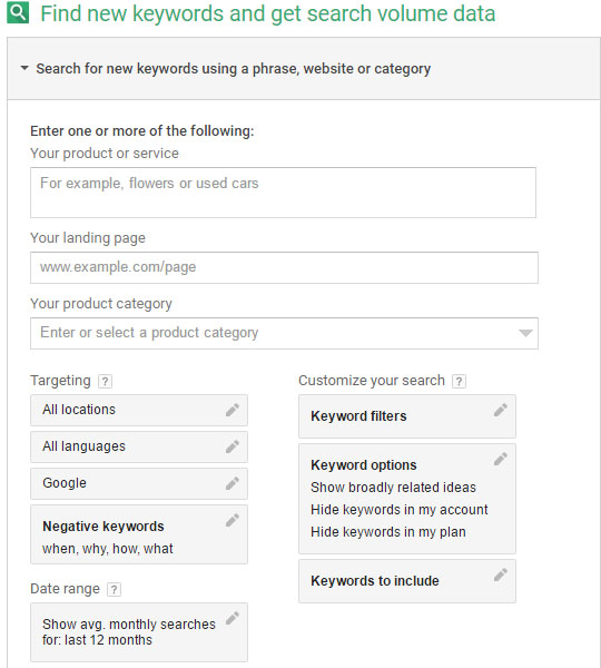
To really get the most of your mobile web app development, you have to separate your keyword research on mobile searches and Desktop searches. This you can do, again, with a free tool like Google’s Adwords Keyword Tool.
Now here comes your skill and instinct. If you develop in Responsive and already have significant traffic coming from mobile (if it already exceeds 25%). Do you optimise Long-Tail keywords for Desktop search, or Short-Tail keywords for mobile? Do you create copies dedicated and designed first for mobile or a mixture with keywords for desktop? Going forward, are you able to find out how much money you get through search conversions coming from desktop and those that come from mobile?
Do not segment your mobile traffic
It is generally considered that mobile traffic is that coming from smartphones and tablets in the same way. But watch out, the behaviour of both segments is different!
While the smartphone user has a native mobile behaviour, with an average duration of less visits and more nervous navigation, tablet users have a much more similar pattern to a desktop or laptop user’s behavior.
In fact, you use your tablet at home and as a second screen, that is, while watching TV in a relaxed atmosphere. Couch surfing it is called in English. So if you want to take the development of web and mobile applications optimization seriously, you have to segment your mobile traffic into “smartphone traffic” and “tablet traffic”. Note that I refer to “smartphone traffic” (I ignore traditional phones on purpose). It is very easy to make this segmentation. Simply using your Google Analytics account, create an advanced segment and filter accordingly.
With this small customized report, are you able to see traces and different user habits in the smartphone and tablet? Is there a big difference in conversion (or other KPIs you use) between the two? Create yourself another advanced segment with desktop traffic and tablet traffic. How they are similar? Does the tablet user look more like the Desktop or smartphone user? Or are they a unique and different segment to be treated differently?
These are just 4 common errors or omissions common to developing websites for mobile. Whether you want to or not, your client or your reputation will be affected, so take seriously the development of mobile web applications.
The e-commerce is hard. And mobile optimization even more. Do it right the first time


