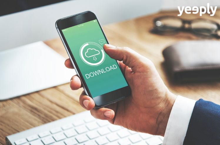
Checking your email via mobile devices is becoming more common. Optimizing a newsletter for mobile should be a priority for companies, just like having an app itself. In fact, 53% of mobile users open their email through this device, according to a Nielsen study.
We need to be connected and communicated even when we use public transport or take our lunch break. However, according MarketingTechBlog, about 80% of mobile users indicate that it is not easy reading these emails from mobile, if not that they often prefer to do it from a PC.

This situation presents an opportunity that if we take advantage of it, can give very good results. As Enrique Quintano commented to us, the director of HTML5 Spain, in an interview with this blog, SMEs particularly have to make their content accessible to their clients, and the newsletter for mobile is a good way to do it. Achieving this is simple by just following these tips to optimize a mobile newsletter by design and usability apps:
Content: short and concise
It is always better to go straight to the point, opting for a short but concise newsletter for mobile is much more effective. This ensures that the reader does not get tired of reading half way through the email.
Simplicity is a plus. Instead of putting multiple images on that are slow to load, it is much better to simplify the content to be quick to be displayed on the mobile screen.
Before sending your newsletter do all the tests you need and preview how it will be in different mobile devices. It is much better to do several tests to eliminate possible errors and send a newsletter to be the same for mobile, tablet or PC.
General design for a newsletter for mobile
It is very important to pay attention to the overall design. In cases of well adapted newsletters for mobile we find two very important aspects:
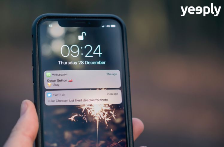
It is essential to know how to draw attention to the links that interest us and making it easy to ‘click’ is essential when adapting the newsletter to mobile issues. Making it visible and easy for the mobile user, for example using buttons instead of traditional links inserted in the text. And even enabling push notifications.
Maintain a single column to make the content easier to read. If you prefer a design in two columns for users to read the newsletter from the computer, make sure that it is a responsive web and it suits the type of device and screen.
The screen size
The screen size of the devices is one of the factors to take into consideration a lot in design for a newsletter for mobile. It is very different reading through mobile screens than doing so from a computer.
Please note that all the content may not be able to be seen on a mobile screen. In this case, the reader will need more motivation to continue reading. Avoid long texts and give an attractive design.
If your newsletter inevitably needs a lot of text to ensure that important content is read, place it at the top of the mail.

Related posts
Mobile marketing: downloads vs. engagement
Imagine that we are in a football match. Two teams take the field: the “Downloads” team − which seem to be very strong − and ...
Why you need an omnichannel strategy for your digital project
To create a seamless user experience, multiple channels are needed, but they will not offer complete accessibility unless they are connected to each other in ...
Territorial marketing and new technologies in tourism apps
Territorial marketing, also called city marketing, is a concept that deals with the territory as a product. It has some characteristics that differentiate it from ...

Best SEO Tips for 2021 from Marketing Experts
It is no wonder that Google likes to refresh its SEO algorithm. In reality, over the course of a year, you can find them to ...

What is Neuromarketing and How to Apply it in a Company?
In a market awash with options and in which several companies will have to contend with each other to cover the same need, neuromarketing enables ...

Voice Search: 6 SEO Strategies for Future Success
Voice search has become part of everyday life for many people. Currently, there are almost 4,2 billion devices with a digital voice assistant and the ...
9 effective techniques to get more mobile app downloads
It has been a long journey and you have finally arrived at your destination: your brand new app is published in the app store. But ...
How to maximise the value of your app’s push notifications
Push notifications can range from being really appreciated by users to be a real nuisance for them. Finding the right balance to reap all the ...
Is Augmented Reality (AR) the Future of Social Media Apps?
AR or augmented reality is one of the emerging technologies, to have a strong impact on social media apps in recent years. The technology is ...

How To Choose A Great Name For Your Business, Like A Boss
Congratulations, you’ve decided to take the entrepreneurial leap. You have your idea fleshed out and a business plan waiting in the wings. Now for a ...